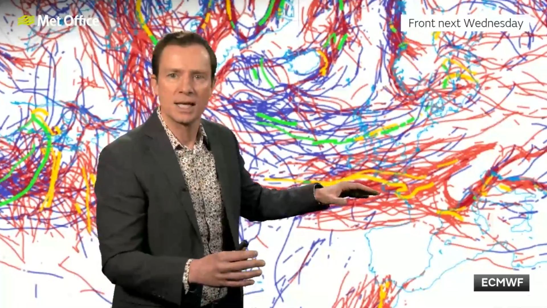
Here's an interesting chart from the ECM's 0z run - apparently the red lines show the various positioning of the warm front next Wednesday, one line per ensemble member! Can't say I've seen that sort of chart before, normally the spaghetti plots are for 850s, or 500hPa heights or similar.
It's from the MetO 10-day trend video, the one where Alex Deakin mentions that there could be some "dumps" for Scotland!
The link for that is on the Media thread if you've not already seen it.
https://ukwct.org.uk/weather/warmfront.jpg

Originally Posted by: Retron